How everything connects in TheyDo
Overview
In most companies, the things teams create to deliver the customer experience sit in separate places: insights in one tool, metrics in another, and the roadmap somewhere else. In TheyDo, everything connects into one structure. Every insight, opportunity, solution, metric, and persona links to others and to the journey it relates to.
This connected structure is called the experience context graph. It's a living model of your customer experience that makes analysis, filtering, and AI-powered reasoning possible.
The spine: from strategy to evidence to outcome
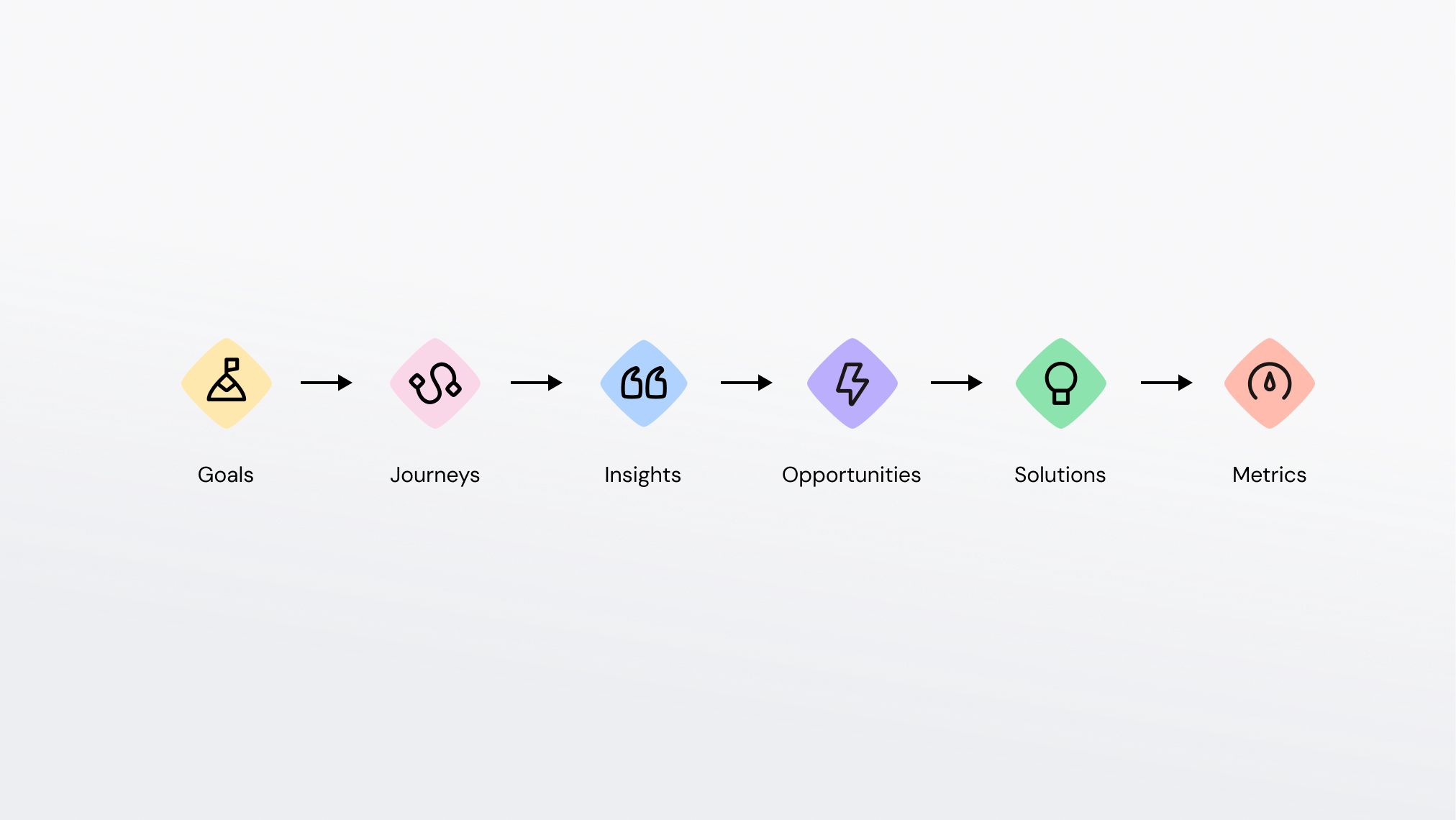
The simplest way to understand the graph is to start with its backbone: a chain that runs from strategy through to outcome:
Goals → Journeys → Insights → Opportunities → Solutions → Metrics
Each link tells part of the story:
- Goals: the business outcome you're working toward
- Journeys: where the customer experience lives, organized into phases and steps
- Insights: what you've learned about that experience
- Opportunities: the gaps worth solving, inside one journey or across many
- Solutions: the initiatives, features, or changes you ship
- Metrics: whether it worked
Because each element links to the next, you can always trace backwards: from a shipped solution to the opportunity it addressed, to the insight that justified it, to the goal it served.
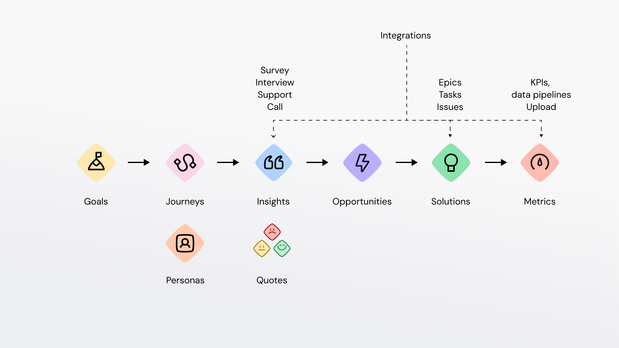
The full graph
A few more elements connect into the spine:
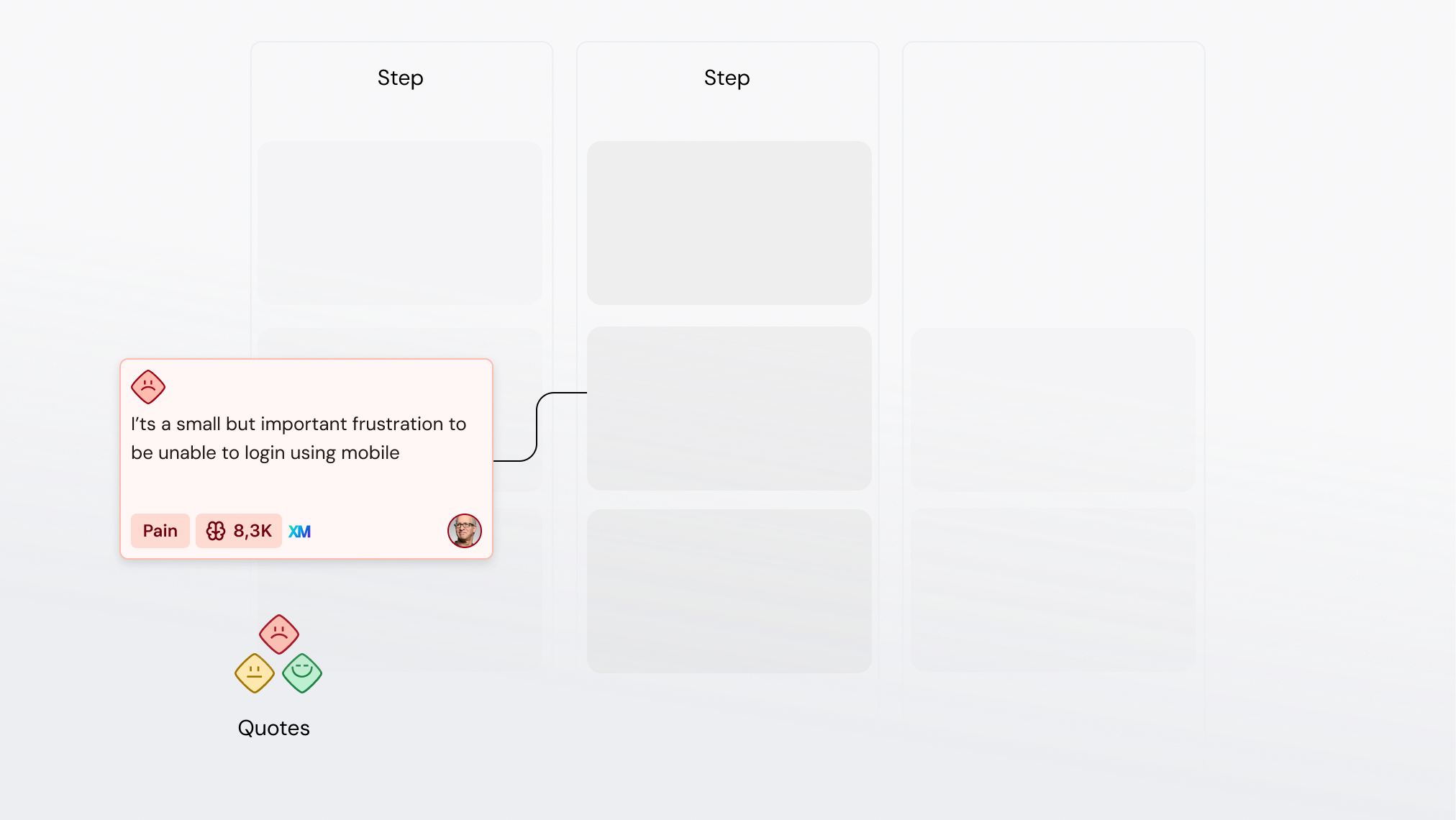
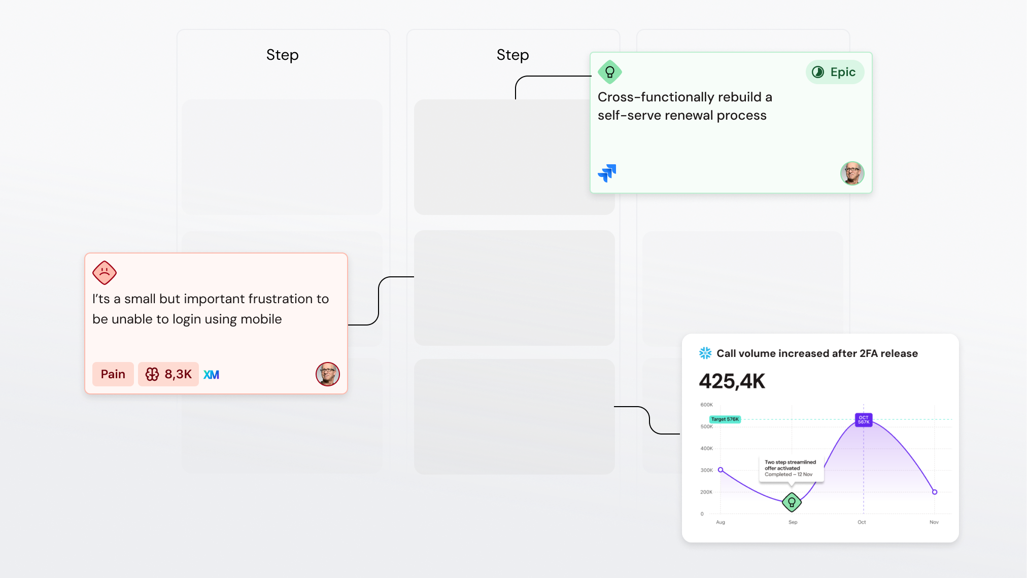
- Quotes are the raw customer verbatims beneath your insights. Every insight can point back to the specific quotes that support it.
- Data integrations bring in external evidence and numbers. Sources like Qualtrics, Snowflake, and Medallia flow in as metrics you can place on journey steps, or as source data you can mine into insights.
- Personas connect across insights and opportunities, letting you compare how different customer segments experience the same journey.
Each of these connects into the graph rather than sitting beside it. A quote attaches to an insight, an insight attaches to a journey step, a metric attaches to that same step, a persona attaches across the insights and opportunities it relates to.
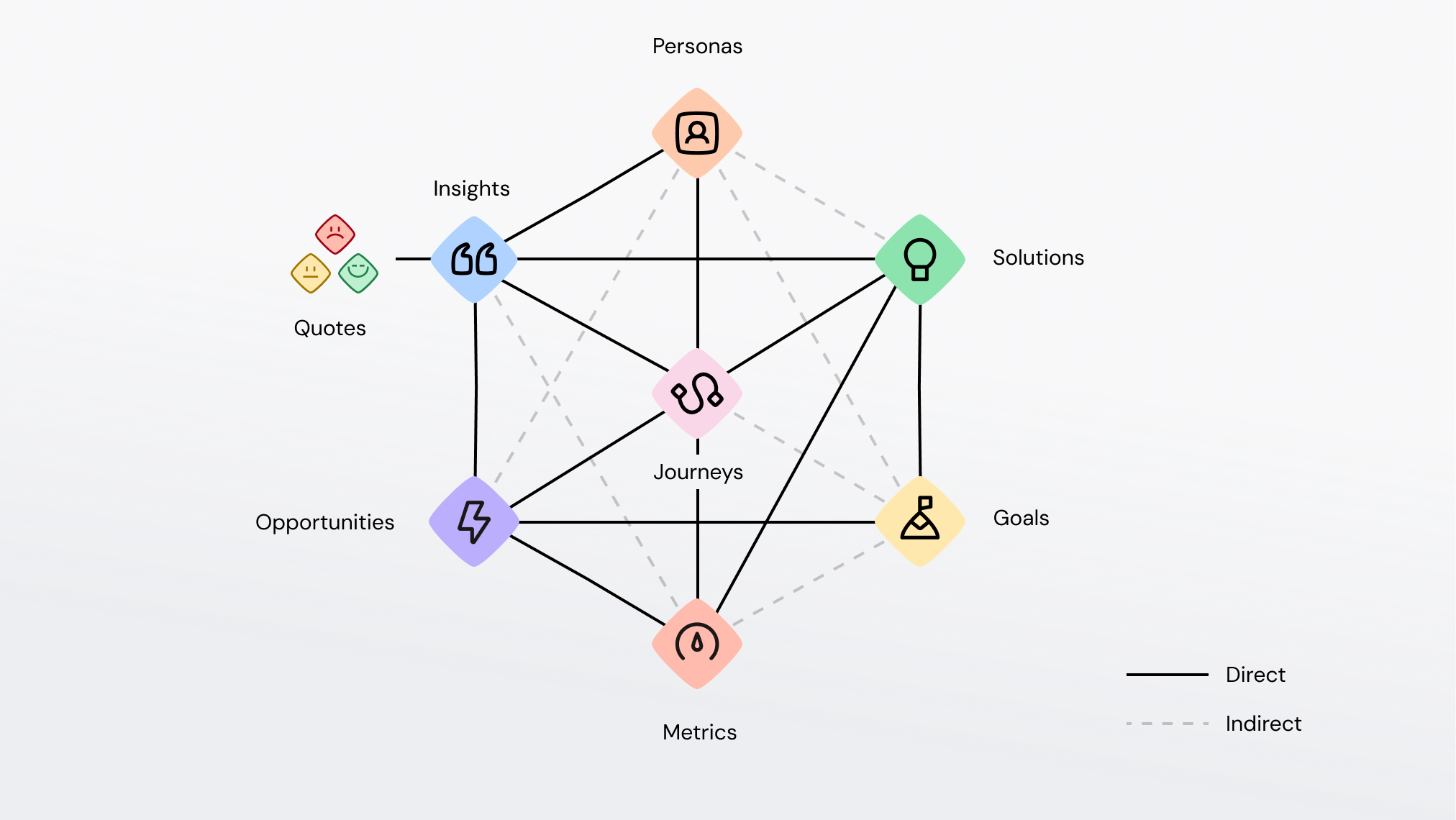
Two relationship patterns
Two patterns show up throughout the graph. Recognizing them makes the whole structure easier to read.
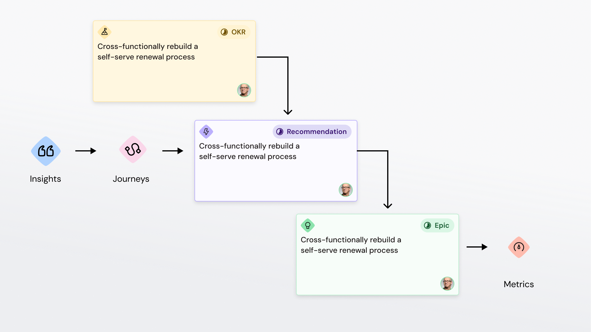
The Goals → Opportunities → Solutions tree
This is the strategy branch. A goal breaks down into the opportunities that would move it, and each opportunity is addressed by one or more solutions. Because the links run both ways, progress rolls up: as solutions advance, you can see how close you are to the goal.
Because opportunities and solutions trace back to customer experience evidence and link to the journey step showing where things happen, it becomes possible to measure the impact of shipped solutions on both customer outcomes and business performance.
The Quotes → Insights → Journey chain
This is the evidence branch. Raw quotes are interpreted into an insight: a pattern that holds across multiple data points. That insight is then anchored to a specific location in the journey, at a particular phase and step. This means an insight is never just an assertion; it carries its evidence (the quotes) and its exact context (where in the experience it happens).
Why the journey step matters
A journey step is a position in the customer experience, effectively a coordinate. Both qualitative evidence (insights from research) and quantitative measures (metrics from your BI and analytics tools) attach to that same coordinate. That shared position is what lets two completely different kinds of data describe the same moment and be reasoned about together.
Opportunities work differently. Unlike a step, an opportunity isn't pinned to one location; it's a pattern that can recur across multiple phases, steps, or even different journeys. The same friction might appear in Onboarding > Setup and in Expansion > Configure. It's one pattern showing up in two places, and TheyDo treats it that way.
Most data is organized by calendar time (what happened on which date). A journey step organizes data by experience structure: where in the customer's world something happened. That's what turns scattered experience data into something structured and queryable.
Taxonomy and tags: the shared vocabulary
A graph of connected building blocks is powerful. A graph with a shared vocabulary layered over it is what makes analysis really sing.
Taxonomy is the shared language of your workspace: the tags, statuses, and types that everyone uses consistently. Tags let you slice across the graph by channel, geography, job-to-be-done, team ownership, or whatever dimensions matter to your org. Statuses track where work stands so progress is readable across the whole model.
Without a consistent vocabulary, the graph connects but you can only look at one thing at a time. With it, you can filter, group, and compare across the entire structure:
- Find every opportunity tagged to a given product area, regardless of which journey it lives on
- Compare experience by persona, channel, or job-to-be-done across journeys
- Roll up solution status by team to see where delivery is moving
Tip: Consistency matters more than completeness. The same idea tagged three different ways splits into three piles that never line up. Agreeing on a shared taxonomy early and keeping it tidy as you scale is what keeps cross-journey analysis trustworthy.
What changes when everything connects
When your customer experience lives in one connected model, three things change:
- Alignment: every team works from the same picture, so the customer stays in the room when decisions get made
- Speed: teams stop rebuilding context from scratch for every project; the understanding is already there and current
- Trustworthy AI: the TheyDo Agent reasons over this graph rather than guessing, which makes its answers auditable and traceable back to evidence
Because evidence and numbers share a coordinate, and because opportunities aggregate as cross-cutting patterns, you can ask questions like:
"Show me onboarding opportunities where qualitative complaints are rising and the activation rate is falling over the last 90 days."
That question reaches across personas, insights, metrics, opportunities, and time, and it's only answerable because everything is connected in one graph.